NAD Color Palette
Using the Seventh-day Adventist® Church in North America’s corporate color palette is a quick way to identify with our church. When designing any materials for print or screen (online or video), use these colors.
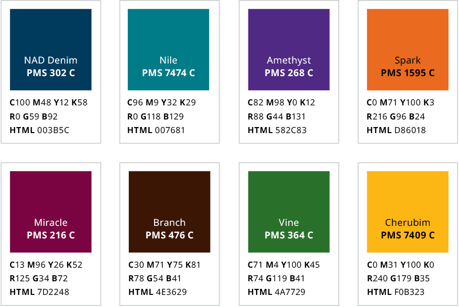
Our Denim Blue
The North American Division uses denim blue as its core identifying color, even though the Adventist primary color palette consists of many colors.
A note about PMS vs. CMYK vs. RGB: Never choose the PMS color in your software and then change your color space to CMYK; the results will be different than shown here. If using CMYK, be sure to enter the values shown under each color to the right instead of doing an automatic conversion. The same goes for RGB or HTML.
For printed materials, let your printer handle the CMYK conversion.
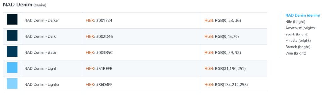
NAD Color Palette – Digital Expansion
The North American Division, in working with the General Conference, has expanded the color palette to include variations of the approved NAD color palette for use in digital expressions. This includes use for websites and social media.
Here is a link to that page on the ALPS library website. All the extended color values are given for HEX and RGB, including but not limited to the NAD Denim.
Typography
Consistent use of typography helps build visual familiarity with our brand and ensures that materials for the North American Division of the Seventh-day Adventist® Church have a cohesive look.
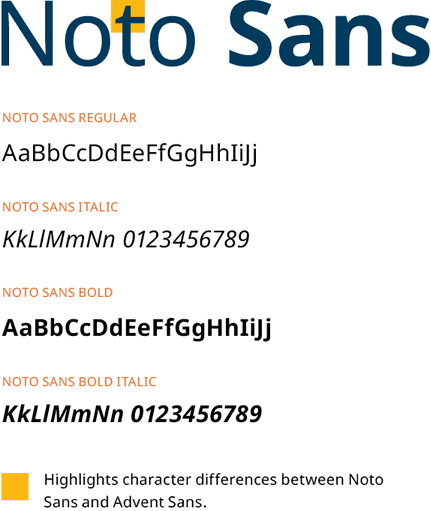
Official Font
Intended Uses
Headlines, subheads, callouts, and body copy.
Electronic Communications
Use Noto Sans for Word, PowerPoint, email, web, and other electronic communications.
Logo Font
Advent Sans looks very similar to Noto Sans because Noto was used for its basis. However, if you take a closer look at the tall letters, you will notice they are slanted.
Intended Uses
Use Adventist Sans exclusively for design of department or entity logos and signage.
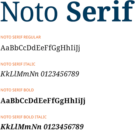
Alternative Fonts
Intended Uses
Use Noto Serif for body text and callouts.
Other Acceptable Fonts